Dia & Co Retention Funnel
New Feature Adoption
Role: Senior Manager, Product Design
Responsibilities: Led Customer research, stakeholder interviews, wireframes, usability testing, and end-to-end design.
Team:
Product Designer
Product Manager
Two Engineers
Collaborated with Merchandising, Customer Experience, and Styling Leads.
Business Goal: We observed that boxes that include “choice” items or an item that a customer selects for themselves has a higher overall keep rate and also a lower cancellation rate for the box. Customers engaging with this choice feature was hovering around 8%-%12. We were tasked with a goal of increasing this number to 25% overall adoption.
Solution: Create a linear flow that guides customers to seamlessly add items of their choiceice to their box
Impact: Increased AOV, increased Take Rate from, this rate is highest it’s ever been, with %50 adoption for new customers engaging in choice, and around 33% overall.

The Problem
After looking closer at the currrent experience we hypothesized that there were three main challenges we’d have to overcome to increase this number that spanned across five different parts of the experience.
challenges:
1. How we were communicating the feature
2. Awareness of the feature
3. Technical constraints
and where they occur:
Email
Rate My Item Flow
Post Conversion
Box Reorder
Box Status Page


Update the copy to be customer-centered
This was another entry point into the experience that was having more success, we hypothesized because the copy contained a clear call to action as well as more incentive to use the feature. You can almost hear our desperation for people to use this product, it feels business first rather than customer-first.
We needed to give the proper context and communicate value for this feature.

Testing Different Copy
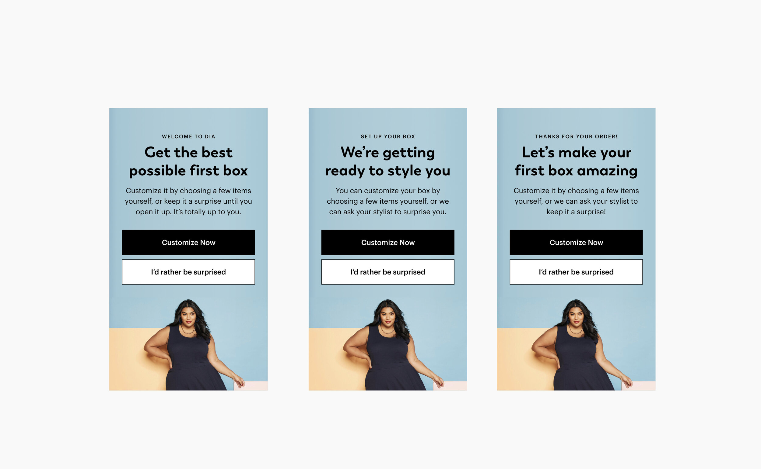
We updated the copy to better communicate the feature and to give customers clarity about their options and give them reasons to choose items.
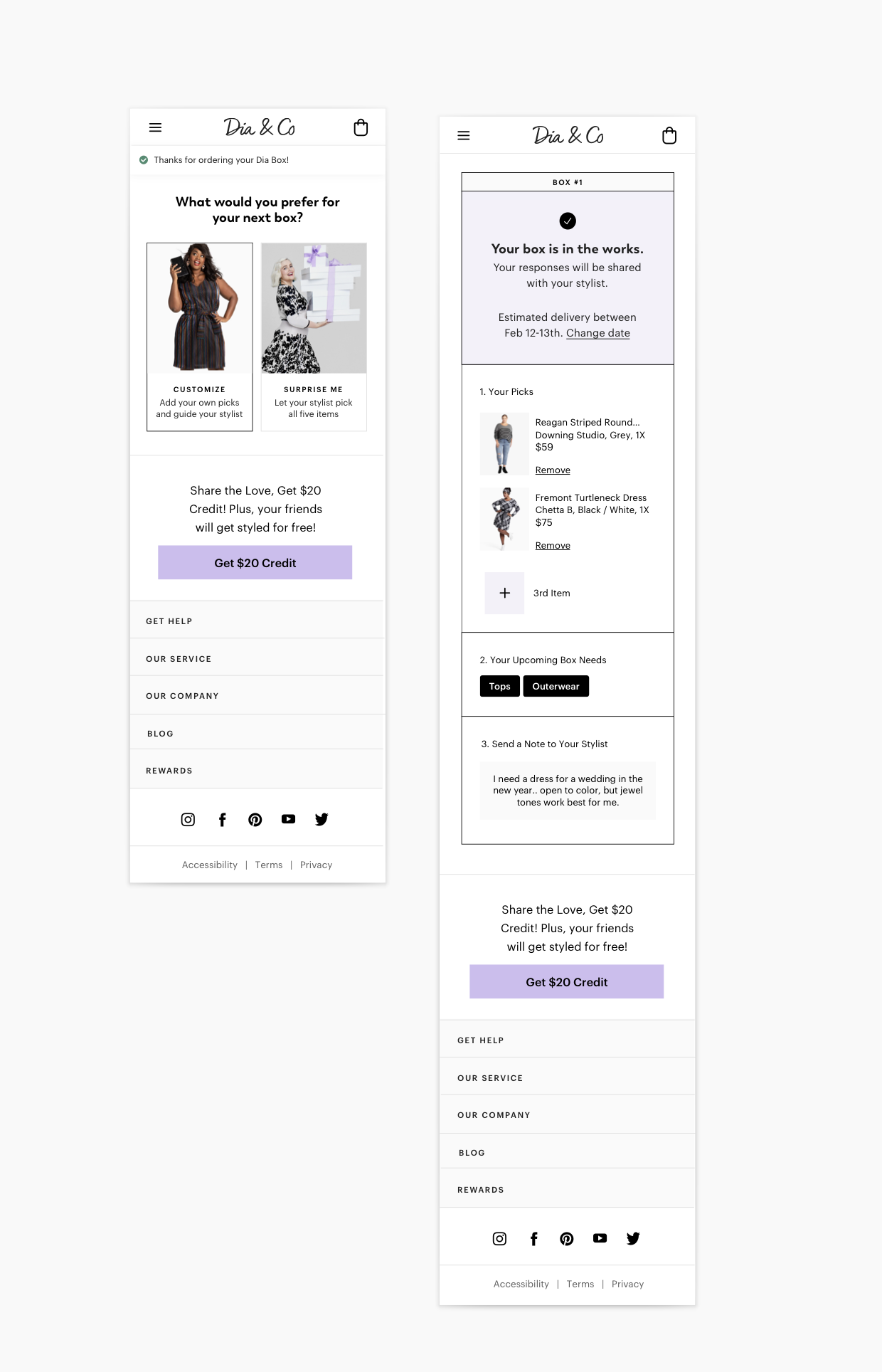
After several iterations, we landed on “Customize” and “I’d Rather be Surprised.” We believed customize as a CTA was stronger than the previous shop now. We added a second CTA so that everyone could make a selection and not feel bad.

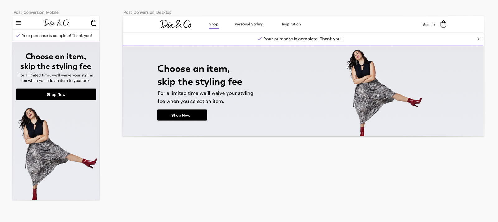
Update the Entry Point for Converted Customers
Our next steps were to create a clear entry point for recurring customers who visit the page to check on box status.
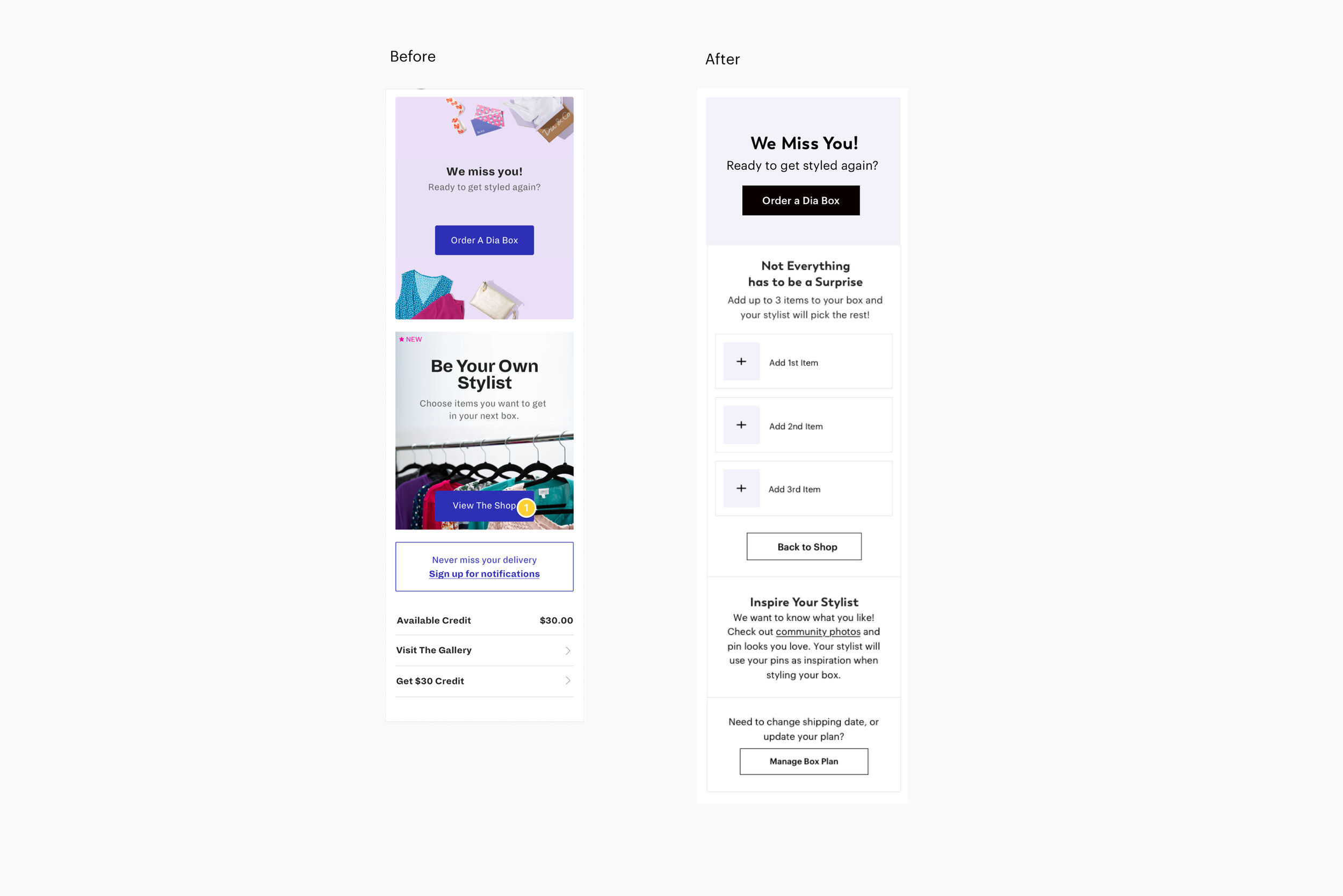

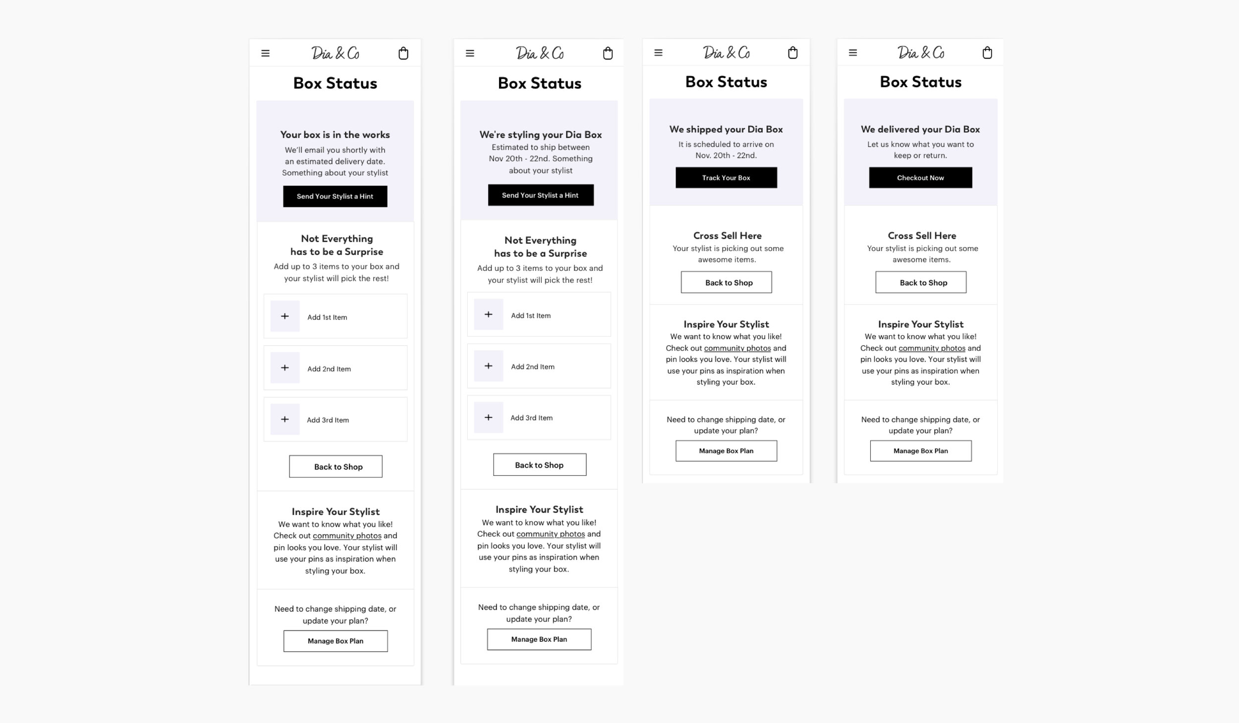
Box Status Page Redesigned for Every State

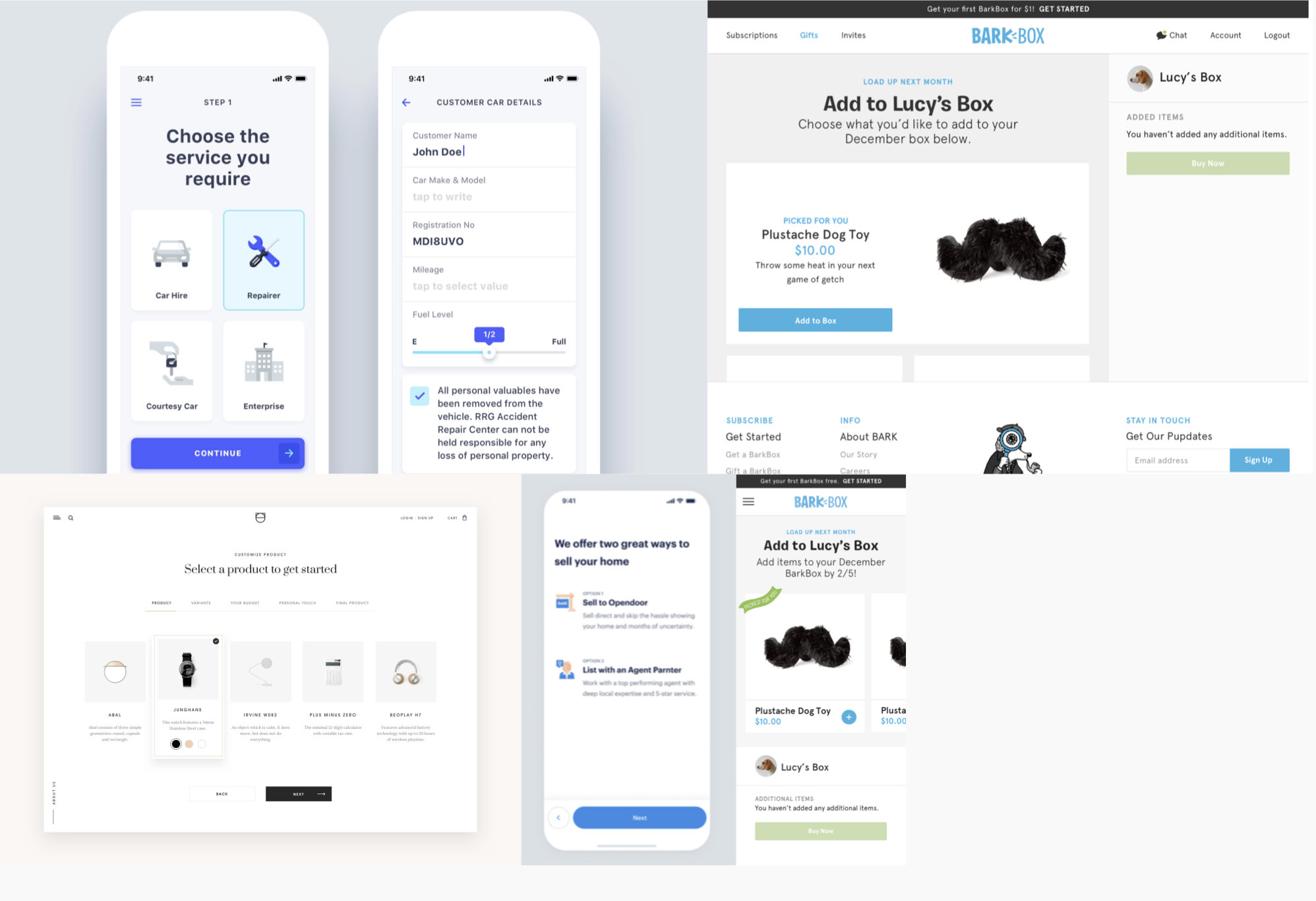
Vision for the Future State
We hypothesized what the future state of this page could be and in general if it was needed.
This Box Status Page reflected only orders made from the styling service but we now had ecomm orders as well. It was becoming more evident that our customer-facing UI was reflecting our back of house dependencies and not necessarily. We questioned the necessity of all these features and were even able to cut a few legacy items and provide more clarity with others.

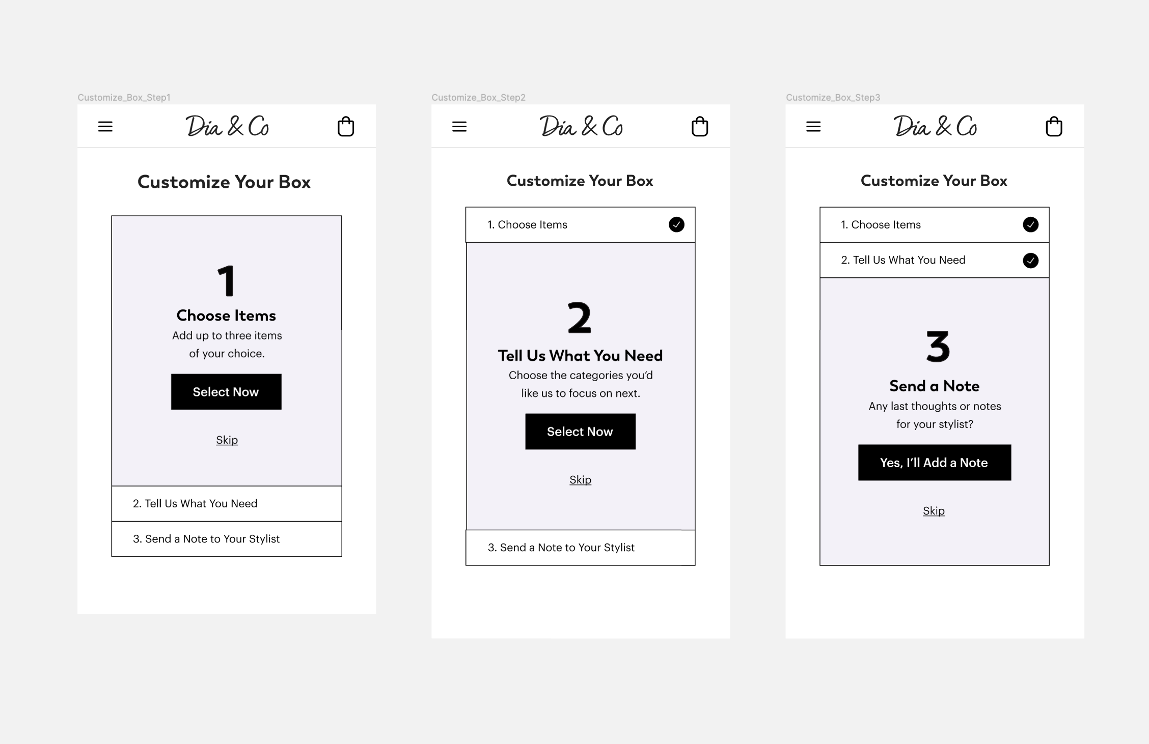
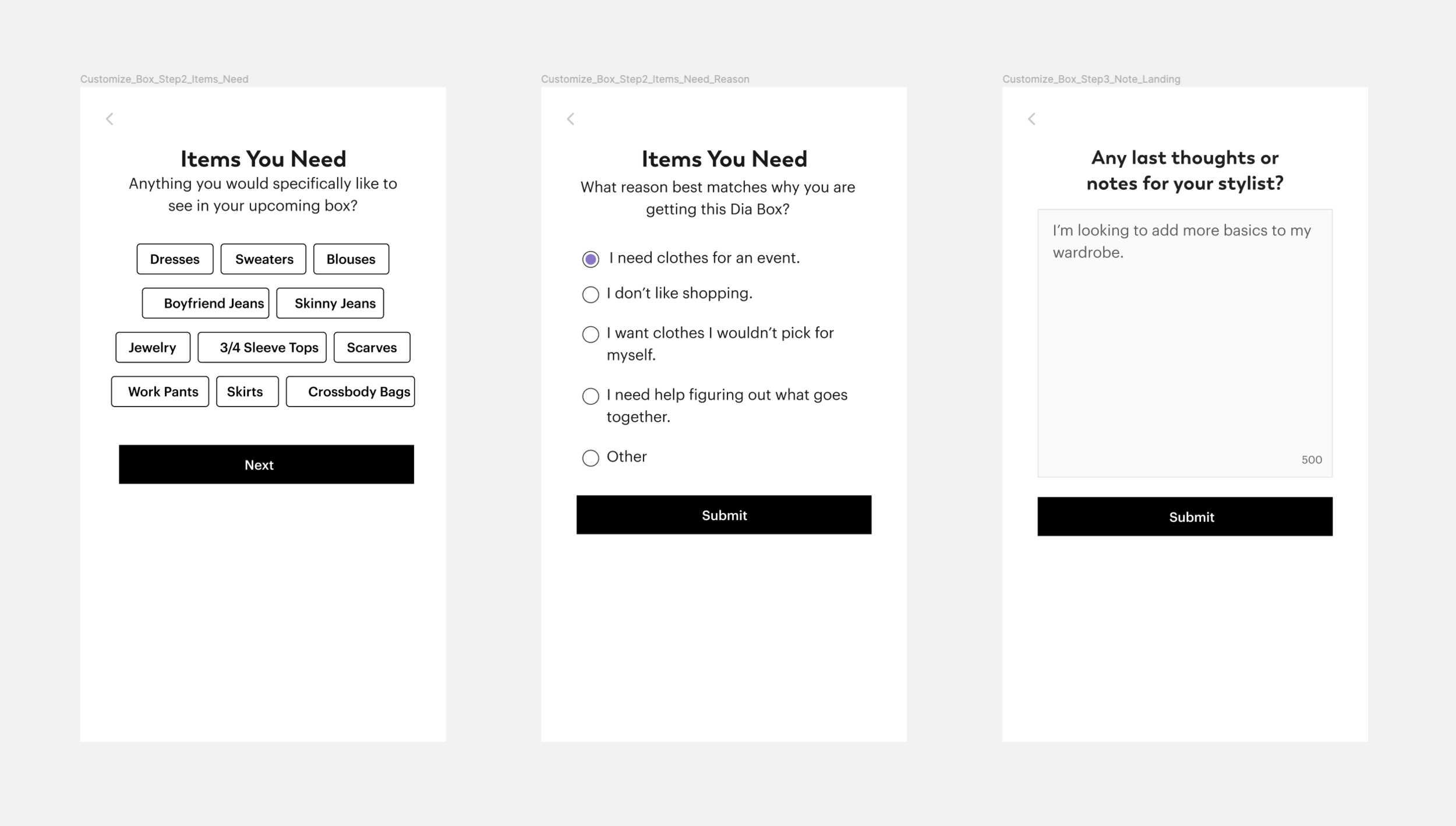
Concept: A Linear Flow as a Checklist
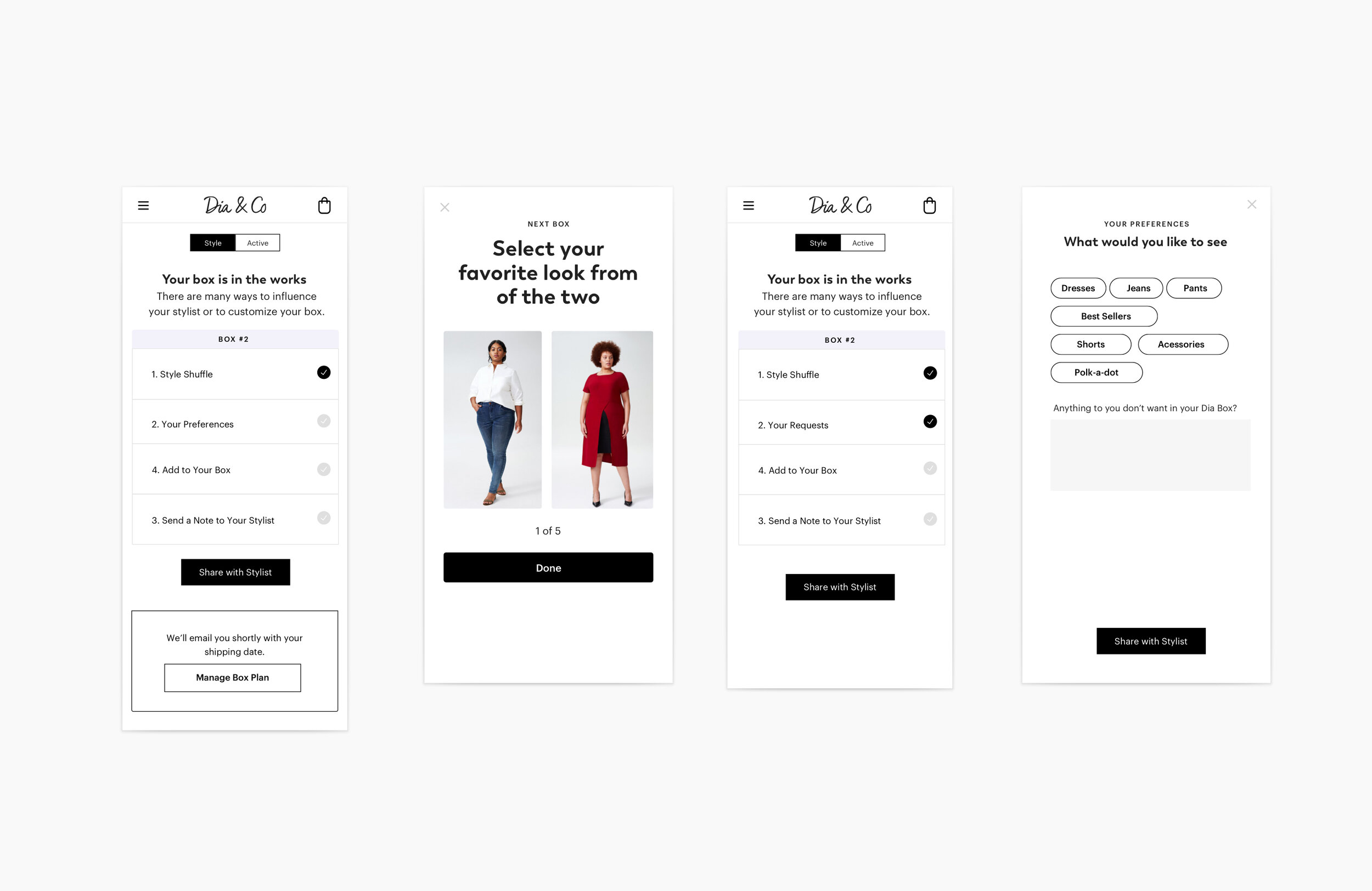
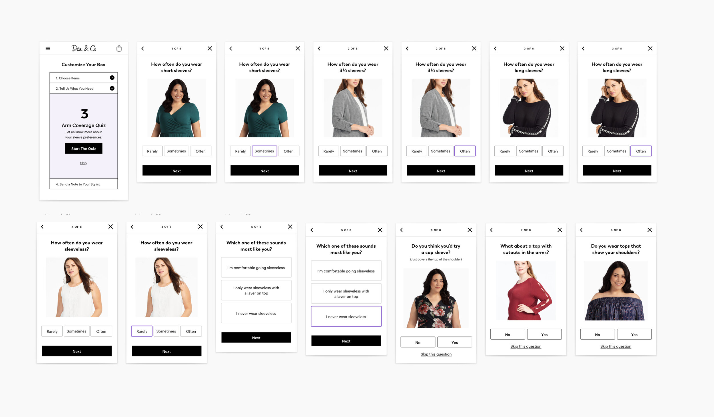

V1 Linear Flow Checklist
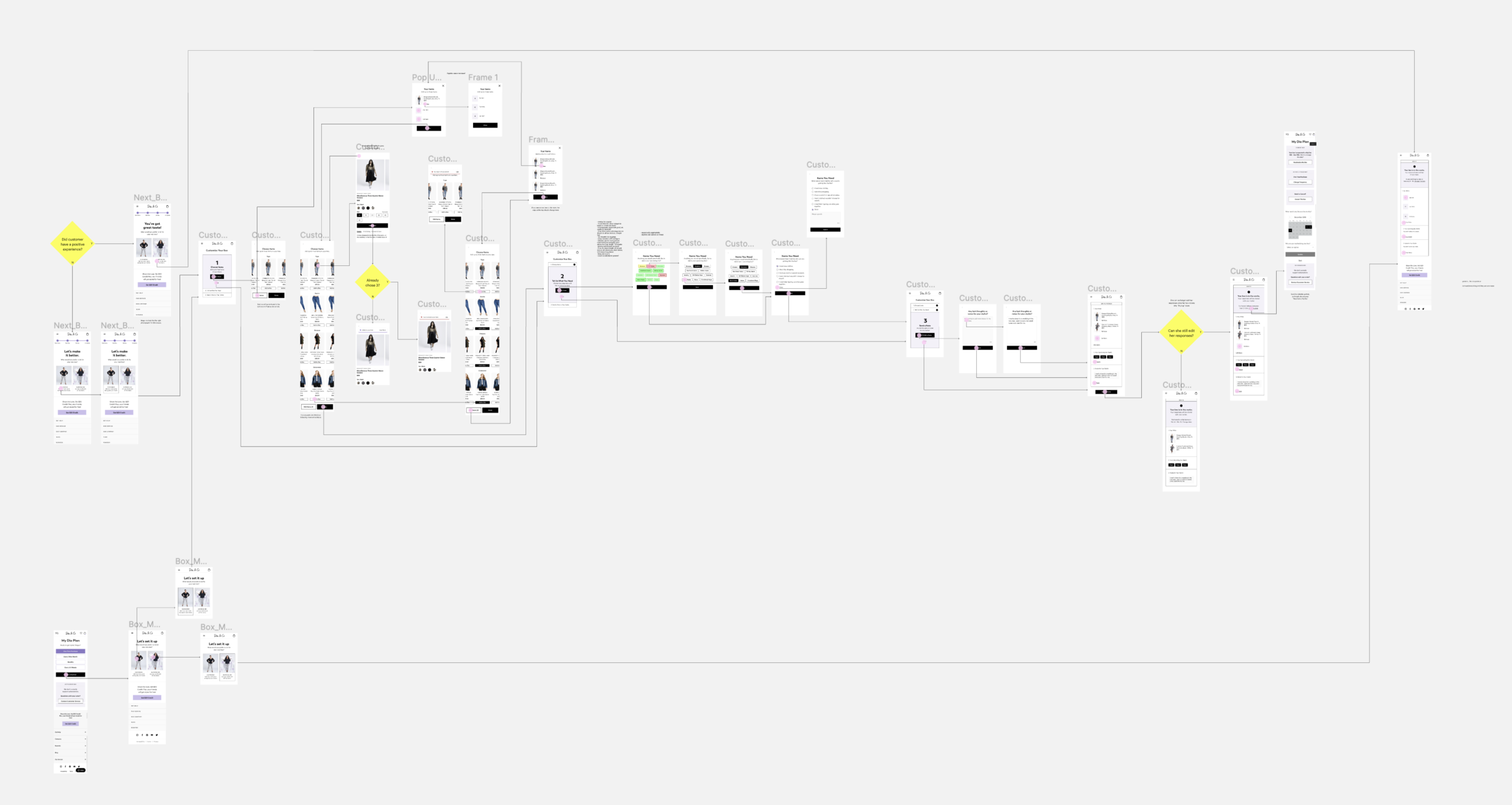

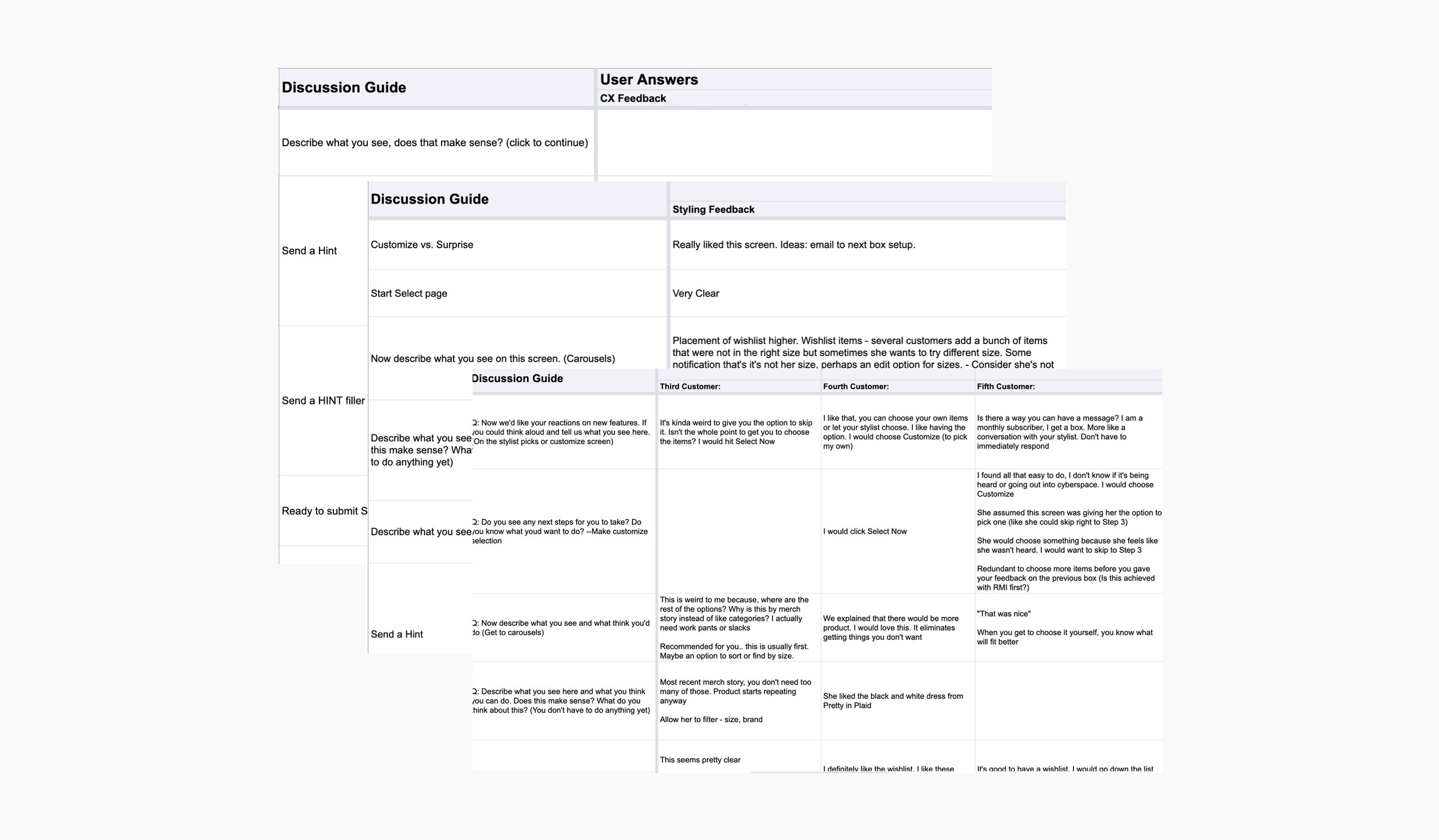
Feedback and Iterations
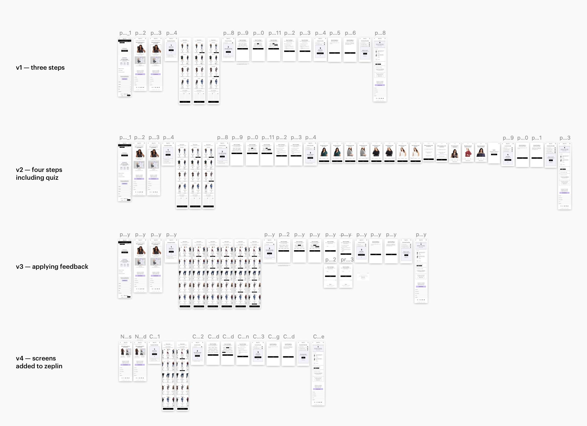

Overhauled all the Entry Points to Funnel through Box Setup Flow

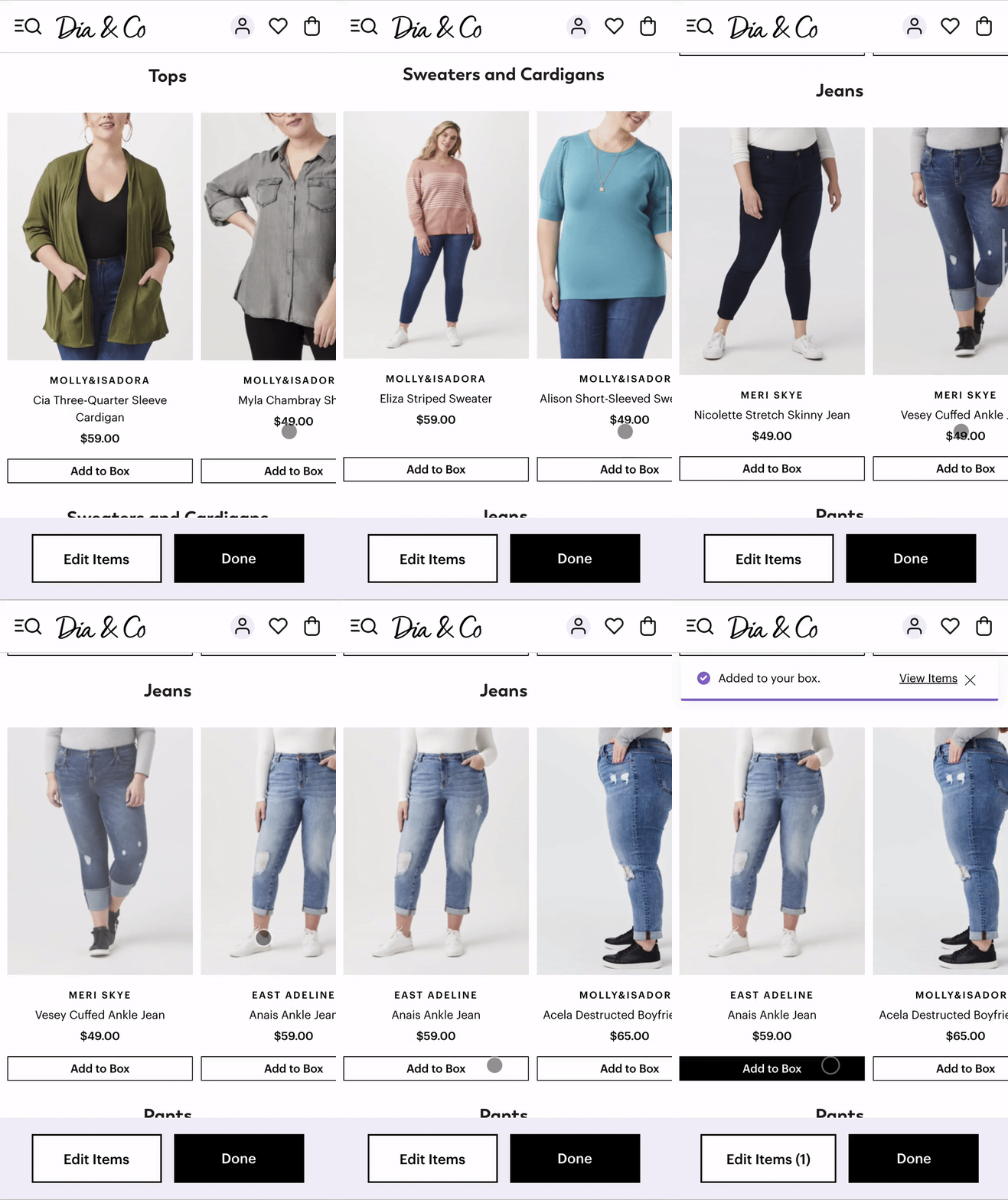
Customers can add up to three items to their box

